If your online advertising is bringing you more business than you can handle, you may not need to read this. You can still benefit, though, by learning how you can pay less for the leads you get. How? Build better landing pages.
It’s not rocket surgery.
If your ad is compelling enough (and that’s a separate topic) people will click on it and end up at your website. Where they land is critical. You have 3-5 seconds to impress and get them to stay on the page and take the action you want them to take, whether it’s to buy something from that page, call you, fill out a form, give you their email address, download something, claim a coupon or any other action.
Let’s take a look at the top 3 AdWords ads for the search term “virus cleanup grapevine tx”:
First Landing Page:
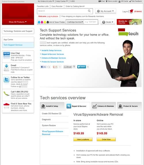
This is a “kitchen sink” landing page with multiple issues:
- It’s way too busy – too much going on and I’m not sure where to look. Instead of zeroing in on the exact phrase I was searching for, this page attempts to show the visitor absolutely everything this business does.
- The links that pertain to virus cleanup are below the fold – so they’re not visible when a user lands here.
- There are too many calls to action on the page. You can search, you can log in, you can search for ink and toner, you can find deals, you can contact any department, you can tweet, like, and share the page, you can see all their products, you can start a shopping cart… and more. All of these choices are higher up on the page than the information about getting viruses removed from your computer.
- Even though I put my geo location in my search phrase, I still have to “find a location” on the site.
- The 800 phone number makes me wonder if they actually have a local presence or if it’s a national retailer that wants to capture business from everywhere.
Second Landing Page:
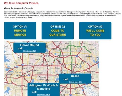
This landing page is much more focused:
- The entire page is dedicated to the specific search phrase I typed in, which is good.
- The map with locations is a great visual indicator. I immediately know this is a local business, with local phone numbers.
- At first glance, the three options at the top are genius. HOWEVER, they’re not links. The text is underlined, fooling you into thinking those are hyperlinks, but they’re really nothing. A huge missed opportunity to lead users to the desired action.
- The only clickable elements on the page are the links to a $25 savings coupon. And that text is very tiny.
Third Landing Page:
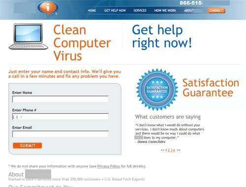
This landing page is the best example:
- The page is very tightly connected to the search phrase.
- The design and layout are clear, uncluttered and all the important info is above the fold.
- It is immediately clear that the desired action is to fill out the contact form.
- It is clearly stated what will happen when you DO fill out the form.
- There is a graphic assuring visitors that they have a Satisfaction Guarantee, which helps establish trust.
- There are multiple quotes from customers, also helping establish trust.
- Even though there is navigation across the top of the screen, it is unobtrusive and doesn’t detract from the obvious call to action on the page.
- The only thing this page lacks is some text content that helps the search engines and the human visitors know a little more about how this company does virus cleanup. It could easily be added below the form.
Remember SEO on Your Landing Pages
In addition to the content, layout and design of the landing page, it’s also important to optimize the on-page elements: page title, meta description, headings, image names and alt attributes.
The Money-Saving Secret
One of the most useful things you can do is to create a separate landing page for each keyword phrase you’re bidding on. Don’t just link all your advertising to your website’s home page or Services page.
Why?
The more closely related all of the page content is to the keyword phrase, the higher your quality score. The higher your quality score, the less you pay for the keyword. Even if the number of clicks and conversions remains the same, why pay more for a click than you need to?
Don’t Guess – Test
Try different wording, different colors, different images, different layout. Test your changes one at a time so you can see exactly what the impact is. Here’s more about A/B testing your landing pages.